Which personality traits did you choose to respond to and apply to the typeface?
STRIKING - features
CONTRAST - colours
DIRECT - no confusion when talking together. very to the point but not blunt
LAYERED - theres more that meets the eye. Quite reserved.
CLEAR - very understandable and confident when talking and socialising
What are the reasons behind the design decisions you have made for the typeface?
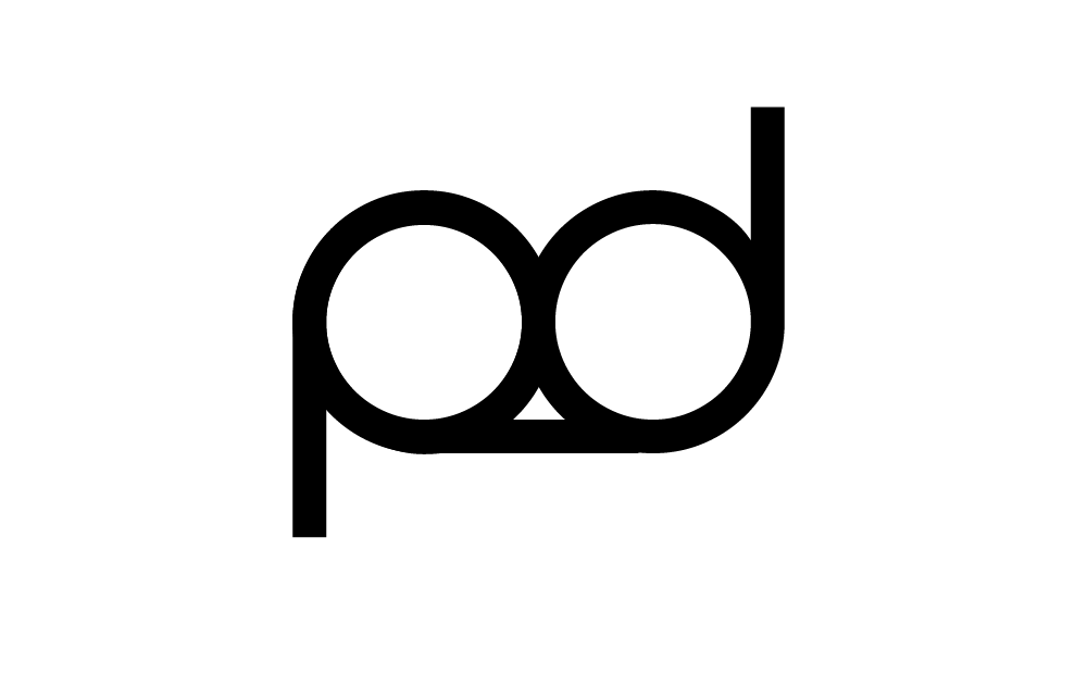
I used both upper and lower case in the typeface to show the use of contrast and further more the use of negative space. The negative space also gives the font the dramatic 'striking' feel needed to respond to the adjectives. I used a bold Arial Black font to give the impact and it created a frame around the lower case making the font seem layered.\
In what ways are the results effective?
The results are effective as they are answering and communicating all the adjectives I was responding to and the letterforms remained legible.
No comments:
Post a Comment