After working hard for a week on the logos we ten had to pick 10 of them that we favour higher than the rest. Afterwards we moved to the next crit groups work and went over the logos they had picked for themselves and we had to whittle each persons selection down to just one by critically analysing each one.
Here are the 10 logos which I selected as my best. I realised after I had selected them that none of them came from the first 30 or so designs that I did. This shows that being exhaustive and repetitive can reply help to get the worst out of you first and move on to the better or best.
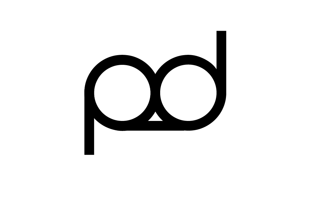
This was the logo which the group criting my work chose for me to continue to develop.

The feedback they left was positive and constructive.
They noted the good points that it represents a ukulele and that it was compositionally pleasing.
However the type needs developing to bring it into context with my 'good' and to create a more rounded aesthetic.
They also noted that I may want to try blacking out the logo or having it as white outlines.
Lastly they advised me to incorporate the text and the string shapes of the symbol and play around with the angle of the image and text together. This I think will be useful for when I go on to develop the logo for the packaging.
No comments:
Post a Comment